In what ways does your media product use, develop or challenge forms and conventions of real media products?
To present our music video we used iMovie. We used this because it is very straight forward to use but has lots useful effects and transitions to make our music video the best it could be. However in the start we were going to use Final cut but this was very complicated to use as we had an old version and we found whilst using it, it would not be as effective as iMovie. For our ancillary product we used Photoshop to do all of our edits.
In our video we wanted to use conventions of pop video however at the same time we wanted to try and challenge some of these conventions and develop them to work for our video. some typical genre conventions of a pop video are:
a link between the lyrics and visual images
close ups
references to sexuality/nudity
long shots
bright colours
light lighting
Hair and makeup is fancy
Location

When we researched pop music videos we noticed that most music videos had at least 3 or more locations in them. In out music video we have filmed in 3 different locations so this is fitting with the location conventions. When we researched what type of locations that they filmed in we found that for most up beat pop music videos they were generally in studios using artificial lighting however they would have some scenes that would be outside that would mostly be using natural lighting. However we had to break the convention of using natural lighting when outside as we were filming in the dark and this meant you could not see anything through the camera. This led to us having to find ways of lighting up the setting we solved this problem by using torches and also we found whilst filming that the sparklers lit the setting up a lot more then we imagined so in scenes with the sparklers we did not need any other lighting. We have followed Andrew Goodwin's theory as he states that a girl group will often have a dance sequence and this is the reason why we have used big studio spaces.
Lighting

For the lighting in our video we used many different techniques to try and achieve different effects to make the video more interesting. We managed to create a shadow effect by using a white light from a projector we got the inspiration for this from the silhouette for example in the video FourFiveSeconds. We found that this silhouette shot which is create by a certain lighting was used in many videos that we looked at however we developed and turned it into a shadow. The sparklers that we used created a lot of light especially when we used three together we decided not to use any other lighting with this and just have the light coming from the sparkler. When we were researching we found another video that used a sparkler however they used artificial lighting as well heir for we have broke this convention of always using extra lighting. however if we had used extra artificial lighting it would have made the whole setting lighter which would then fit in with the convention that is that most scenes are bright and do not using dark settings. We followed the convention of a music video by using a coloured background when doing my researched I noticed that this was used quite a lot that would use block colours such as pink, blue and green as a backdrop and lights it up to make it very bright. However as we did not have any coloured walls we used a projector and created a power point slide with lots of different colours on it and played this through the projector which lighted up the wall a particular colour which created the artificial lighting for that particular setting. We also used torches to create some artificial lighting for example when we were filming in the dark in the outside setting we placed to torches in the background of where the individual who was performing at the time was standing and made the torches flash. this meant that it lit up the background but also gave a really professional looking effect in the background. This fitted in with the conventions of a music video as although we were using a dark background the individual stood at and was the main focus. The last convention we challenged in terms of lighting was when we were in the editing stages and we wanted to try and lighten some clips but in a unique way as we did not just want to change the colour filters. To do this we layered a clip of a sparkler over the clip of the person who is miming this is challenging the convention because usually to make the clip lighter they would use filters and also if thy were to layer clips they would usually use other people in the group or a dance scene they would not however use a prop.
Angles
This two angles were both inspired by Fifth harmony Bo$$ video we used a mid shot with a black back ground with one person in the group this is a convention and is seen quite often throughout music video it is used to show an individual or artist up close. This follows Andrew Goodwin's theory of having a lot of close ups of the artists throughout the video. We also used a 5 person shot to promote and show the whole group united together which is also very often seen throughout music videos which are performed by group artists. This is because most audiences like to see the group all together.

These two shots are breaking the conventions of a pop music video. We have used a high angle group shot for the last few shots of our video we have not seen this in any other music videos that we have researched because they usually end with a low angle shot of the group which makes them look more powerful or they use a mid shot of the whole group to see all there faces. We however choose this high angle shots because it shows the whole group together and also shows the money floating with is mainly what the song is about it is about earning money and respect so we believe this was a very symbolic ending to our music video. Although we have had feedback which disagrees with us we have also have feedback from people who really like this so we have decided not to change it. We have also used a long shot of an individual which does not break a convention of a pop music video however the setting we have used it in does. This is because usually when a long shot is used it is because there is other things going on around the individual. however in our shot we have placed her in a setting with a plain grey background and bright flooring although this may look boring she is doing part of a dance routine which makes it more interesting and she is moving which covers the blank background.

This shot is a two person shot which breaks the conventions of a group pop music video as the would usually have the whole group of as individuals. However it fits the conventions as it is a low angle shot which makes them look dominant and important which is part of the message of the song.
This breaks the conventions of a pop music video as it is an extreme close up of lips. this is not often used as it is not representing the group and would maybe be hard to edit to get the lip syncing correcting so some people may stay away from this.
Lastly we used a focus pull which is also breaking a convention of a music video and would normally be found in a film or TV show when focusing the camera from one character/object to another character/object. However we decided to use a focus pull because we liked the look of having a blurry image which is often used in music videos however we developed it in to a focus pull so the blurry image would then focus on the individual who would start lip syncing. I think that this shot is very effective and I think it makes the video more interesting.
Props


All of the props that we used within our music video followed the conventions. For example we used money which represented lyrics within the song that are video is too this therefore follows one of Andrew Goodwin conventions that the visual will often link to the lyrics in the song. I believe that we used all of our props very effectively and without them the video may not have been as successful for example at the start of the video we use some balloons that lay on the floor these add colour to the scene and without these balloons there it would look very empty and would not look as effective. I also think that the sparklers add a unique twist to the video as they are not often seen in music video for the reason of this I am not to sure however when doing my research I only saw one other video that used sparklers. However if I was going to do this again I would make better use of the glow sticks as I do not think that they look very effective however they do fit the narrative and continues on the theme of the neon paint and also the bright colours used as backgrounds.
Costume/Make up


We did not follow the convention of having lots of heavy and dark make up which is often found in pop music video this represents feminism the point of trying to look pretty. During the research we did think that we wanted to follow this convention however we did change our mind closer to filming day this is because we wanted t represent girls which are naturally pretty and feminine without having to wear lots of make up we did this because we thought out target audience would prefer this and it is also something unique and isn't done in a lot of music videos. However we did still use some make up such as neon paint on the faces we thought this looked really effective on them and made them stand out and we have only seen neon paint used in a few videos and we also thought it fit our genre really well. We kept our costumes within the conventions of a music video we had them all wear the same colour outfits for some of the shots and we also had them wear bright colour clothing which is used a lot in pop music videos and we also had them wear red white and blue which are the colours of the American flag and also the theme of our music video this meant that what they were wearing went with the narrative of the song.
Editing
This editing technique is the use of two different angles of the same shot which have been placed together the continuity of this shot in my opinion s very good. This fits in with the conventions of a music video because they often use different angles of the same scene and edit them together this makes the video more interesting and adds more view points instead of having one continuous shot.
This editing technique is similar to the one above however to create this effect we used the same image and then in editing e split the clip and on the second half of the clip we zoomed it in which makes it look like we have used to different clips. This was very easy and quick to do but is also very effect and made the video more interesting. However to make this better i could of used more cuts and zoomed in at different lengths.
To create the technique of the clip of the flashing lights we used a long clip of them standing with the flashing light and the made it faster by the maximum which is 20x. this made the clip alot shorter however the flashing became very fast we then layered this on top of the other clip but did not allow for any shadow so it looks like another cut we also placed this so it goes in with the beat with the music which is another convention of music videos.
To create this effect we used a split screen and then had it swipe in and out. This is a common convention of a music video as it it makes it very interesting and means you can show more then one clip at a time. We also did this when we had a individual lip syncing at the start however we did not use the swipe we only used the split screen. If I was to do this again I would use completely different clips which could make it more interesting.
The layering effecting with fading is another convention of a music video. this is used to merge clips and have them over lap each other. we layered one clip over two different clips. this was challenging the convention as the would only usually layer over one clip at a time however I like how ours has turned out as I think it creates an interesting effect and link the three clips together the flashing lights also look very effect going through all the clips.

Slow motion is another effect which is commonly used in music videos however it is usually used in slower songs to exaggerate or to show emotion. However we have used with a fast song which goes against the convention. However I do feel like the way we have used it has turned out to be very effective and it provides a break from all the fast movement which can be quite relaxing to a viewer.
Digi pack
These were our main inspiration for our album cover and the back of our album. Most of them follow the conventions of pop album covers however a few do break them for example Beyonce back album cover breaks conventions by having a picture of her and also by using her name on the back this is not often seen that much however we do think that it look quite effective.
This is the pictures that we have decided to use for our digi pack this follow the conventions for a group digi pack as in features everyone in the group together it also follows the conventions because they are all wearing similar or the same coloured clothing which represents them as being united and like they belong together. However we have broke conventions by using a picture where the group is holding a prop which is covering them. This is often not used because as it can been seen as taking away focus from the artist however in our case we think it will add to the successfulness of our album cover.

This is our final tour poster. We have stuck to the conventions by keeping the same colour theme throughout our digi pack and music video. We have also used the whole group as I explained earlier. We have also included tour dates which is a convention of a tour however when doing my research I noticed that less artists are putting tour date and are now only putting social media contacts and a website. I think this is because social media is becoming more used and for younger artist who have a younger target audience are more likely to be in contact with there friends through social media. We have also followed conventions by making the name of our group large which is a common convention used by many up and coming groups. In this tour poster we did not go against any conventions.

For our album cover we followed conventions such as having a picture of the entire group they are also wearing similar colours of clothing. We also followed the convention of having the same colour theme throughout our music video and digi pack. However we challenged conventions such as having the artists autographs on the from of the album i did not see any other artist that did this throughout our research. However we really like this idea because we thought as it is an up and coming group this would be a way of viewers to learn more about the individual artists. We also challenged common conventions such as making the group hold props however this was vital and was a way of promoting the album name as the group is the main focus of the album cove so when the viewer looks at the group they will also see the album name.

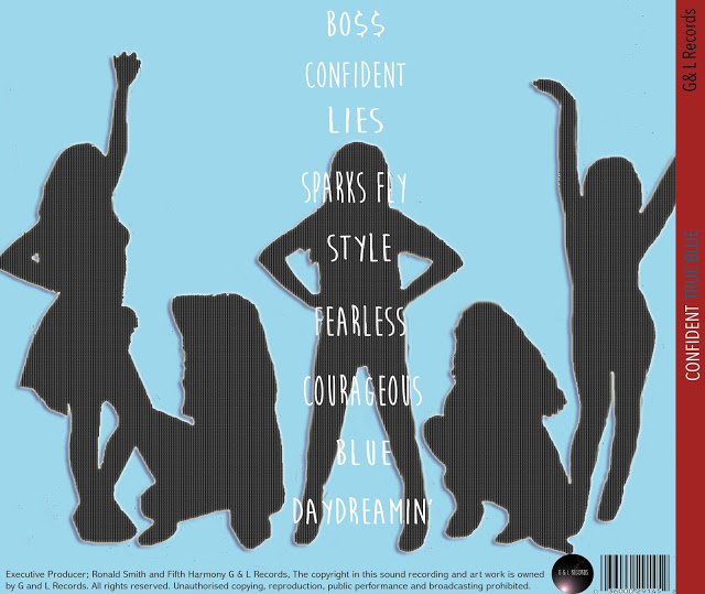
We also followed some conventions for our back album cover such as we followed the same colour theme. We have also included a barcode and record label logo and fine print which is all commonly found on the back of CD covers. We have also included the titles of the songs and we were inspired of the layout of this from Marina's album. However we have gone against conventions like Beyoncé and included a picture of our group on the back however we have developed this and make it so lit looks like a silhouette.


 In our A2 work we used a lot more effects then we did in AS this is because we did not know about them however in our A2 we were able to experiment a lot more and challenge conventions. However I do think that using certain effects would have made our AS work better for example in the scene we could have used hard light which I think would of really made this scene and setting a lot more interesting.


