 This is Rita Ora's Tour poster. On the poster she has a picture of her face covers the majority of the page and then the writing is around it but not covering her. The writing in the page includes her name this is so the person looking at the poster may not recognise her face but may recognise her name. The writing of her name is in bold black writing which matches the boarder of the poster. The sub title is also in black bold writing but is smaller then her name and it further down the page this means that when you look at it this subheading will not be the main focus which is the aim. The smaller text has the information but all of this information is not relevant to everyone. I like this poster because the background adds colour to the black and white writing and i also like the idea that the picture of the artist is the main focus. However i do not like this poster because I do not think that it stands out enough and is not very unique. I from the poster I would use the bold Text of the artist name. However I would not use the black boarder around the edge as it make the poster quite dark and this does not suit the theme of our tour or our group.
 This is Demi Lovato's tour poster. The main focus of this poster is her name Demi which is also the title of the tour and her album. This is emphasised by the Fact the name Demi is covering her face which means that this must be more impotent than her face. However her face is still very important as it covers 3/4 of the poster. The words 'world tour' are in purple and this cover the word Demi this could show that there intending for this to stand out more then the word Demi however i still feel like the word Demi stands out more as it is larger and is the only white text on the poster. The main details are in smaller print and are at the bottom of the poster this is in plain back writing so it does not distract form the element which is going to attract the viewer first. Also at the very bottom of the poster she has but logos of the companies she is working with such as record labels etc. I like this poster because I think the colours they have used are very effective, all the information is on there and gives web links to find additional information i also like the layering of text idea. What I do not like about this poster is they could have put more information on here but they used that space to put the logos. I would use the bright pink text on my poster as it suits the theme and makes I stand out. however I would not use a close up if the artist as I am using a group so this would be too overwhelming for the viewer.
 This is Beyonce's tour poster. She has used a picture which takes up the whole of the poster. However unlike other posters the picture is not just of her face it is a mid shot and the picture also includes the background which is very extravagant and sets the mood for her tour the picture helps to create an emotion in the viewer. Her name is at the top of the poster of black bold letters however I would say that her picture is more eye catching the name so the name would be the second thing that the viewer would look at. The name of her tour is 1/4 of the way down of the page next to her face of the picture they have placed it here so that the viewer will not miss the title of the show. The main dates and shows for the country the poster is tailored to are at the bottom and are also quite bold so it is going to attract people who live near those areas. As this poster is relevant to them. I like the poster because I feel like the information is distributed well over the poster which means that the viewers eye will catch every bit of information on the
poster. I do not like this poster because there is not much of a variety of colours. I would use the bold clear black text of the artists name however I would probably change the colour of the text to something a bit brighter. I would not place the name of the tour on the right hand side near the centre as the picture I am likely to use will take up the width of the poster and I do not want any text to cover it.

This is The Saturdays tour poster it has a picture of the group and it is a long shot. The name of the group is in black I do not think the text that they have used is as eye catching as t could be. directly below this is the name of the tour which is in pink writing and looks like it is dripping like wet paint. At the bottom of the poster is the dates of the shows in bold s the date of the event that they think will attract the largest audience. They also have links in at the bottom of where to get further information. There is also a logo of who is sponsoring them. I like this poster because it has quite a few dates on it which means that the viewer will know immediately whether the can attend or not. I do not like this poster because I don't think that it doesn't stand out and doesn't have a clear theme and connection to the tour that they are promoting. On my poster I would use the bright colour text of the tour name however I would not use the style o text of the tour name as I want to use something more clear.
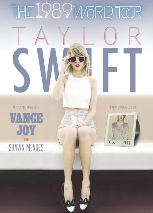 This is Taylor Swifts tour poster. She has used calm pastel colours as her background with a long shot of her in the middle. The name of her tour is at the top of the poster in light up letters this is unique because most tour poster usually just have pain text but you can see that this text is supposed to light up as it would on at a concert. Her name takes up quite a large portion of the poster and is also in pastel colours but are more bold so it stands out against the background. The picture of Taylor covers a part of her surname. However I do not think that this makes much of a difference as viewers would be able to recognise her from just her first name, the picture of her and also the style of the poster as the pastel oculars and vintage look is her stereotypical style. On the poster there is also a picture of her cd and a vinyl and this has been made apart of the miss en scene. In bold near the bottom of the poster is also guests that will appear. I like this poster because i think that it really portrays the artist which makes it very distinctive. I do not like this poster because i think they could have used more
eye popping colours so it would stand out more. From this poster I would use the placement of where the name of the tour is and also the place of name of the artist on my poster. However I would not use the pastel colours as this does not suit the theme of our poster.
 This is Jessie J album. This poster has used three distinctive colours black white and gold. The choice of colours really make it stand out i feel the 3 colours together are also quite aggressive colours which makes people look. the picture used takes up more then half of the poster and her facial expressions are aggressive and fierce which could catch the viewers eye. The name of her tour as at the top of the poster in gold on a black background which i feel like they have done this to make it stand out but i don't think it stands out as much because the majority of the smaller writing is also gold writing on a black background. Her name is in the centre of the picture in gold writing bold and gives the impression that there is a reflection. This stands out more then the other writing because it is on a black and white background. I like this poster because It really stands pout and is in your face due to the fierce colours and picture. however i do not like this picture because i feel like they could have created more enthuses using more of a variety of colours. I would use the placement of where the name of the tour is which as at the top of the poster. However I would not use this colour scheme as the colour is would use would be more girly.
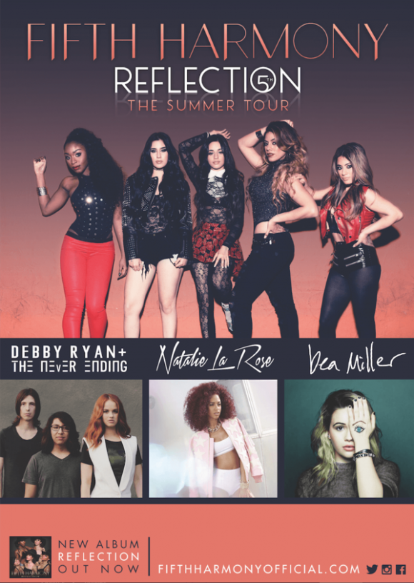 This is Fifth Harmony's tour poster. They haven't chosen bright colours however the colours that they have chosen are contrasting which is making them stand out more. The picture of the artist does not stand out as much because they are wearing similar coloured clothing. The picture is also quite small compared to other tour posters and this is because they have put pictures of the supporting guest on their to. I do not think this is effective because the pictures of the supporting artists distract from their picture which is supposed to be the main focus. The title of the group and the title of the tour i do not think stands out much at all as the writing is not bold enough and is too similar to the colour of the background. I like this poster because i don't feel like that have tried to put too much information on to it so it docent look to crammed. However i do not like this poster because i think that the picture and the writing do not stand out so it would not catch anyones attention. From this poster I would include the Style of text of the artist name and also the name of the tour however I would change the colour to something a bit bolder. However I would not use up so much space for the supporting guests as I would want to promote my artist and there tour rather then the supporting guests.
This is Ariana Grande tour poster. She has used a white background and all the text is in black. Her name is at the top of the poster and they have used a font which is used throughout all her other promotional merchandise so it is unique to her. The name of her tour is in a different text and in grey i do not think that it stands out very much at all. They key dates are in black and grey writing but i think the use of colour for this text looks okay. The picture is on the left side of the poster which is unique to all the other tour poster is have seen, the picture is also in black and white. I like this poster because it is simple and not to overwhelming. However i do not like this poster because i feel like it needs a bit of colour to make it stand out. I Would use the font on my poster as it is clear and stands out I also like the placement of her name which is at the top of the poster and I am considering also placing my groups name at the top. I would not however place the tour dates at the side of the poster as I feel like that this would distract from the picture.
 This is Katy Perry's tour poster. She has used a variety of bright eye popping colours which makes it stand out. The name of her tour is at the top of the poster in a font that is unique to her tour and is used on the album and other merchandise. The name of a special guest it directly below the title but does not stand out more then the title which is important. Her name is 3/4 of the way down the poster and is smaller then the tour title i think that this is okay because she is famous enough to be recognised by her picture which is big and takes up the majority f the poster and also contains bright colours. I think the colours used are very stereotyped towards the artist as these have been used on her album and also on other merchandise to promote the tour. Their is also a picture of her album near the bottom and dates of concerts along one side but this does not distract from the main feature which is going to catch the viewers eye. I like this tour poster because of the eye popping colours. I do not like this poster because it needs a website where they can go for extra information. I would use the bright colours on my tour poster as this would really suit our tour poster and the theme however I would make sure the colours on the artist were drastically different from the colour of the background as I feel like on this poster they are too similar which means the picture of the artist does not stand out as much.
 This is Little Mix Tour poster. There picture takes up the first half of the poster and is similar to the album cover which helps to make it more recognisable by fans. Their name is In white which contrast which the dark background which helps it stand out the font used bass also been used on other parts of their album cover. This text covers part of the picture but is only covering there legs so the viewer can still see their faces this is what they may be recognised by. On the bottom half of the picture it the name of the tour which is in quite smaller font and then below that is the dates which they are performing however i feel like they have out to many of the dates on there which makes it look quite overcrowded. In a red box at the bottom out has when the tickets go on sale which helps to promote the tour. I like this tour poster because they have used a recognisable picture. I do not like it because it is too overcrowded. I would use the slogan at the bottom advertising when the tickets go on sale on my tour poster as I think this is important for the public to see so they know when they can get the tickets and I also like the placement of this text as it is not in the way of anything but still stands out.
 This is Marina's Tour Poster. The title of the tour is at the top of the poster in a semi circle in bright colours the text is similar to the one of the Taylor Swift poster. at each side she has a tree with fruits on it which represents the theme of her tour and album. She has not used a picture herself however i do no think this was a good idea as she is not that famous and to get known she should promote what she looks like along with her name as more people are probably going to remember that more then just a name. she has also used white writing on a dark background to promote the dates that she will be performing i feel like this is the main point of the this tour poster. I like this poster because of the bright colours and the information promoted however i do not like it because I think it needs her picture. I would use the bright elements of the background on my tour poster however I would not use the dark part of the background as I think this makes it quite dull and does not suit our theme. I would also not use so many tour dates on my poster as this has led to n room for a picture.
 This is Selena Gomez's tour poster. Her name is at the top of the poster in large gold letter on a dark background which really makes it stand out so the viewer can clearly see what her name is. The picture takes up the whole page and they have made it similar colour to the text which says her name which helps it to flow and to stand out just as much as each other and I think that the dark background really helps this. The name of her tour is underneath her name in red writing in a similar text to her name but is a lot smaller I think they have done this to make sure that her name and her picture are the most prominent thing on the poster. At the bottom of the poster is a picture of her album which helps to also promote this so viewers can seed that she has a new album. and there is also a date on one concert at a particular venue which may attract a lot of people. I like this poster because is think the colour used really helps it to stand out even though they haven't used particularly bright colours. I do not like this poster as it could have added any surprise guests to attract a new audience. I would use the placement of the text and also the style of the text which has been used on my poster. I would use this as I think it is very clear and stands out so the public will notice it and be able to read it. I would also use the large picture which takes up the whole poster as this is also very effective and means that when the viewer looks at it they will focus on the whole poster and not just a small part where the picture is. I would not use the dark colours and the black background on my poster as this does not suit our theme.
When looking at the tour posters I have noticed that the majority of them use picture of the artist that they are trying to promote. The name of the artist and the name of the tour is always included somewhere in the poster but there is no consistent size of font that is used to promote this. I have also noticed that a few have also included the cover and name of the album which I think is a really good idea as it is promoting two things in one poster and this is something that I am going to consider using when I do my own poster. Something I have noticed that I will not so when creating my poster is restricting the colours I use to two or three as I have seen this is not always effective even though it has worked for some it has not worked for all of them.
No comments:
Post a Comment