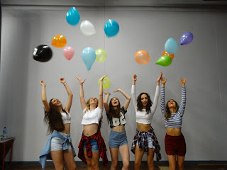
This is the image that we choose for our tour poster. We really like this image due to the high quality, the angle of the image and also the lighting. We also liked this image because we liked the groups facial expressions as they are strong and look confident and that's what we are trying to portray to our target audience. We also like there clothing and we think it represents them as individuals.
We then cut that photo out using Photoshop. On Photoshop we used a magic wand tool and also background eraser tool. We did this so it could be transferred on to our tour poster.

We put the cut out image onto a red background as this is the colour background that we wanted. We then used our font research to try different fonts to see what they looked like with the image and also on a red background. When creating this we followed the draft we had made closet and we only had to change a few things such as the size of the image and some of the text.


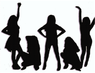
 When Workings on the Back of our album cover there was a few more things that we needed to include for example the barcode and the record label logo. This is a convention of a digi pack and appears on the majority digi pack. we also included some fine print about who was involved in the album and about the record label just like a draft suggests. However when creating our draft at first we did not want to include a image on the back of our album cover hover when working on it we found an effect on Photoshop that we really like and we thought would be effective on the back of our album cover. we used the same image as the one on our tour poster and used an effective to change it into a silhouette. We also used our font that we found in our font research and created how we wanted to space out our song titles. however when we put it on to the back album cover we wanted to make the text of the songs white to fit in with the red white and blue theme of our digi pack.


